Design process
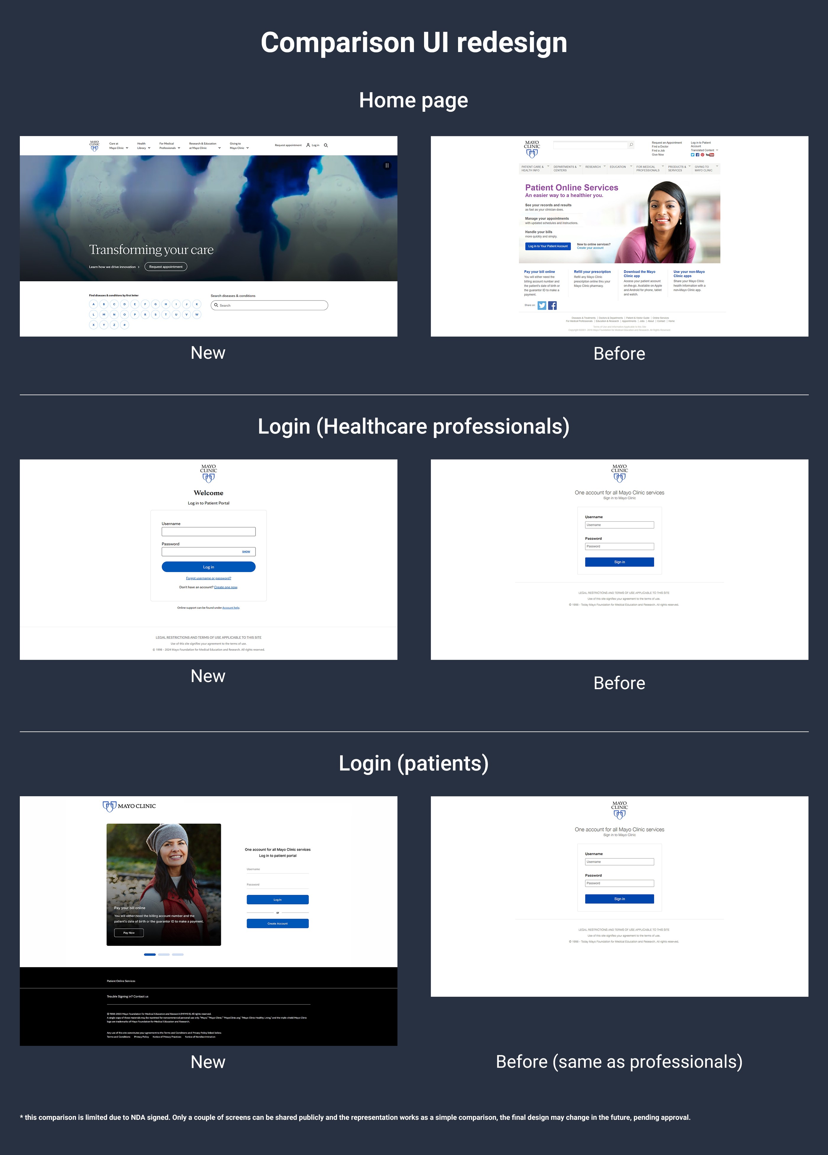
The process of improving the user experience on the Mayo Clinic website started with careful planning, which included competitive analysis, user research, and heuristic evaluations to identify major pain points. This thorough groundwork set the stage for an iterative process that included data analysis, ideation, prototyping, usability testing, and final actionable recommendations for a more polished and user-centered design.
With a six-month project timeline and the product owner's existing design schedule, we had significant time to thoroughly refine and iterate on these key workflows. By optimizing these critical functions, we aimed to create a more intuitive and efficient platform that better serves the needs of Mayo Clinic's patients.

Competitive Analysis

In-depth Research
Contenders: These organizations have a relatively high market share but may lack significant innovation or differentiation compared to the leaders.
Leaders: These organizations have both high market share and strong innovation and differentiation, making them industry leaders.
Niche: These organizations may have a limited market share but focus on specific areas of expertise or geographic regions, giving them a competitive advantage.
High Performers: These organizations have a high market share and are likely to be innovative, but may not have the same level of brand recognition or differentiation as the leaders.
Based on the revised classification, the top three competitors in the healthcare industry are:
1. Mayo Clinic: Demonstrating exceptional market share and innovation, Mayo Clinic maintains its position as a clear leader in the industry.
2. Stanford Health Care: With a strong presence in both market share and innovation, Stanford Health Care is a formidable competitor.
3. Cedars-Sinai: Known for its high level of innovation and differentiation, Cedars-Sinai has a significant competitive advantage.
Based on a comparison of Mayo Clinic and Stanford Health Care's websites, it's apparent that Mayo Clinic could benefit from a more modern and user-friendly interface. Stanford Health Care's website often features a cleaner layout, more intuitive navigation, and a stronger emphasis on digital health tools.
Key considerations for Mayo Clinic's website modernization include:
• Enhanced User Experience: Simplifying the website's navigation, improving search functionality, and providing more personalized content can enhance the overall user experience.
• Mobile Optimization: Ensuring the website is fully optimized for mobile devices is crucial in today's digital age.
• Integration of Digital Health Tools: Incorporating features like online appointment scheduling, virtual consultations, and patient portals can streamline patient care and improve convenience.
• Accessibility: Ensuring the website is accessible to individuals with disabilities is essential for compliance with regulations and to provide a welcoming experience for all users.
Wireframes for Website Modernization
These wireframes outline the proposed structure and layout for Mayo Clinic's redesigned website. They focus on improving navigation, enhancing the user experience, and integrating digital health tools. Key features include a prominent search bar, a streamlined navigation menu, and clear pathways to essential information like patient resources, appointment scheduling, and medical specialties.


Prototypes for Website Modernization
Prototypes are interactive models of the redesigned website, built based on the wireframes. They provide a more tangible representation of how the final product will look and function. By creating and testing prototypes, Mayo Clinic can refine the design of its website and ensure that it meets the needs of its users.


